A metal building can solve a very practical problem – protecting equipment, adding storage, creating workspace, or covering vehicles – but color still matters. The right metal building color combinations can make a new garage, barn, shop, or RV cover look like it belongs on your property instead of feeling dropped in as an afterthought.
For most buyers, this choice is not really about chasing trends. It is about making sure the building looks clean, holds its appeal over time, and works with the house, land, fencing, and nearby structures. A good color plan also helps protect resale value and keeps you from second-guessing your decision every time you pull into the driveway.
How to choose metal building color combinations that last
The safest approach is to think in layers. Start with the main wall color, then move to the roof, then the trim. If you try to choose all three at once, it is easy to overcomplicate the process. When you build one decision on the next, the final combination usually feels more balanced.
Your property should guide the choice. A residential garage often looks best when it ties into the home’s siding, roof shingles, shutters, or fascia. An agricultural building has more flexibility, but it still benefits from colors that feel natural in an open rural setting. A light commercial building may need a cleaner, more branded look with stronger contrast.
There is also a difference between what looks good on a color chart and what looks right at full building scale. Bright accents that seem minor on a sample can dominate the look of a large workshop or barn. That is why many property owners are happiest with simple combinations that use one primary color, one secondary color, and a trim color that creates definition without too much contrast.
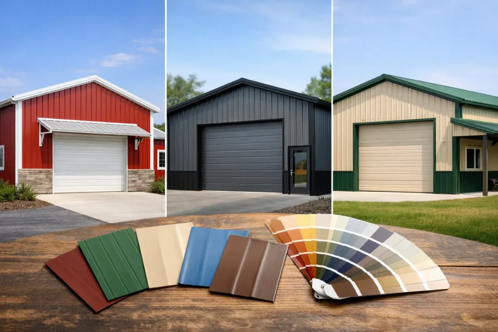
Popular metal building color combinations by style
Some combinations work across almost every building type because they are easy to live with and easy to match. Neutral palettes stay popular for a reason. They look clean, hide some dust, and tend to blend well with other buildings already on the property.
White walls with a charcoal or black roof
This is one of the most dependable choices for garages, workshops, and residential metal buildings. White keeps the structure bright and classic, while a darker roof gives it definition. Black or charcoal trim can sharpen the look even more.
The trade-off is maintenance visibility. White can show dirt, mud splash, and pollen more quickly than mid-tone colors. If your building sits near gravel, red clay, or a busy work area, that is worth considering.
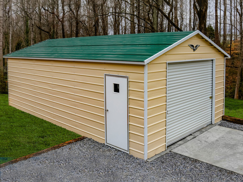
Tan walls with brown trim and roof
For barns, equipment storage, and loafing sheds, tan and brown remain strong practical choices. They sit comfortably in rural settings and tend to hide dust better than bright white. This combination usually feels warm and understated, which is exactly what many landowners want.
It may not deliver a bold statement, but that is often the point. If your goal is a building that looks established and useful rather than flashy, this palette works.
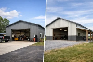
Gray walls with white trim
Gray is one of the easiest modern colors to use. It looks sharp on garages, shops, and small commercial structures, especially when paired with white trim for contrast. A darker gray roof can create a clean, unified appearance.
The key with gray is choosing the right shade. Cool grays can feel more modern and industrial, while warmer grays feel softer and blend more naturally with residential settings.
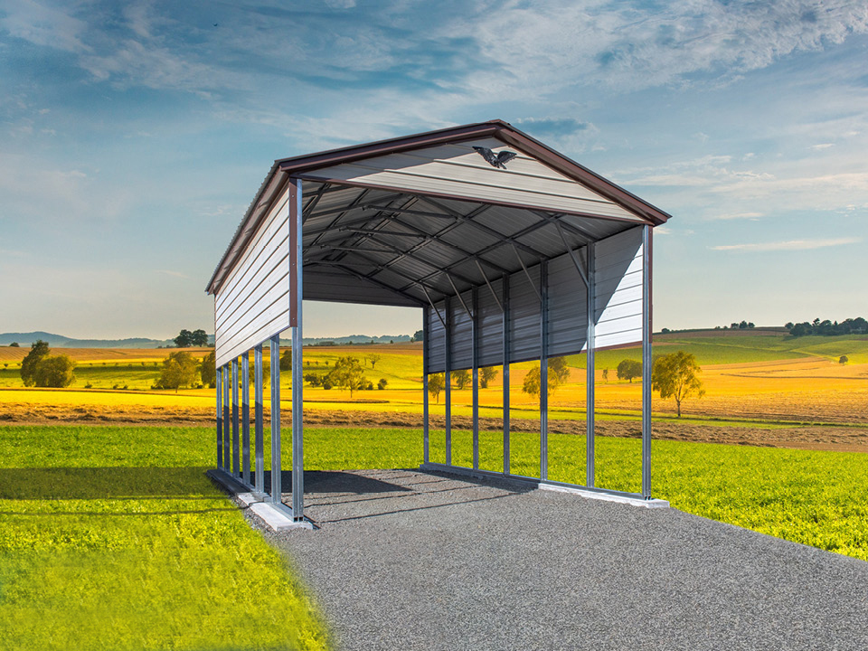
Green walls with beige or tan trim
This is a natural fit for agricultural properties, horse barns, and storage buildings on wooded or open land. Green tends to settle into the background, which many rural buyers prefer. Paired with tan or beige trim, it avoids looking too dark or heavy.
The caution here is to stay away from a green that is too bright. Deep, muted greens usually age better and look more premium.
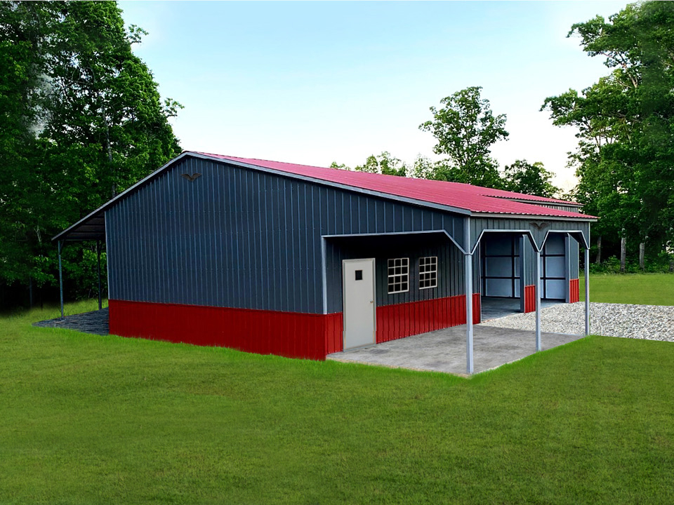
Black and white combinations
For a bold, high-contrast look, black and white can be striking. This style works especially well on modern workshops, detached garages, and some residential outbuildings. White walls with black roof and trim feel crisp. Black walls with lighter trim can look dramatic, but they need the right setting.
Darker buildings absorb more heat, so climate and building use matter. If the structure will be heavily used as a workshop or enclosed garage, that may affect comfort depending on insulation and ventilation.
Match the building to the property, not just your favorite color
A color combination should make sense for the full site. The easiest way to get there is to look at the permanent elements you already have. Your house roof, brick or siding color, driveway material, fencing, and nearby sheds all create context.
If your home has warm tones like beige, cream, brown, or red brick, warm building colors usually feel more connected. If the house has cooler tones like gray stone, white siding, or black accents, cooler neutrals often fit better. This does not mean everything has to match exactly. In fact, exact matching can sometimes look forced. Coordinating is usually better than copying.
This is especially true for detached structures. A metal garage does not need to be a duplicate of the house, but it should look intentional. Roof and trim are often the easiest places to create that connection without limiting your main wall color.
Roof and trim matter more than most buyers expect
Buyers often focus on the wall color first because it covers the most square footage. That makes sense, but the roof and trim are what shape the building visually. They define the edges, break up large surfaces, and influence whether the building looks simple, modern, traditional, or agricultural.
A dark roof on a light building creates contrast and helps the structure stand out. A roof that is close in tone to the walls creates a quieter, more uniform look. Neither is automatically better. It depends on whether you want the building to blend in or serve as a visual feature on the property.
Trim can either sharpen the design or soften it. White trim brightens and separates colors clearly. Matching trim keeps the look more subtle. Black trim adds definition, but it can also make every line feel more pronounced. On a clean rectangular garage, that may be a plus. On a larger barn with multiple openings and roof breaks, it can become visually busy.
When bold colors make sense
Most property owners are best served by neutral color schemes, but that does not mean bold colors are wrong. Deep red, blue, or even black can look excellent when the building has a clear purpose and the setting supports it.
A red barn-style building can feel classic on rural land. A darker blue workshop may look great near a home with matching shutters or roofing. A black commercial-style structure can look polished and high-end when paired with the right trim and site design.
The question is not whether a color is attractive on its own. The question is whether you will still like it five or ten years from now, and whether it will work if your property changes. If you plan to add fencing, pave an area, build another structure, or eventually sell, timeless colors give you more flexibility.
Common mistakes with metal building color combinations
The most common mistake is trying to make the building do too much visually. Too many contrasting colors can make even a well-built structure look smaller, busier, or less refined. Three coordinated colors are usually enough.
Another mistake is ignoring scale. A trim color that looks subtle on a sample may feel much bolder around large garage doors, long rooflines, and tall sidewalls. The same goes for dark wall colors on big enclosed buildings. They can look sleek, but they also create a heavier visual presence.
It is also easy to focus only on appearance and forget use. A workshop in direct sun may benefit from lighter exterior colors. A farm building near dirt lots and equipment traffic may look cleaner longer in tan, gray, or earth tones than in bright white.
This is where a guided design process helps. Tools like a 3D building designer make it easier to test combinations before you commit, which can save time and second-guessing later.
A practical way to narrow your choices
If you feel stuck, start with the style of result you want. If you want clean and classic, go with white, gray, tan, or beige. If you want rural and understated, lean into earth tones like brown, green, and clay-friendly neutrals. If you want modern and high-contrast, consider black, charcoal, and white.
Then compare those options against your property, not just your preference. Ask yourself what matches the house, what will still look good through different seasons, and what makes sense for the building’s use. A custom structure should work hard for you, but it should also look like it belongs there.
If you are ordering a made-to-order building, this is one of the easiest places to get the result you actually want. Essex Metal Buildings helps buyers work through these decisions every day, and the best choices usually come from balancing appearance, function, and long-term fit.
A good color combination does not need to be complicated. It just needs to look right every time you see it on your land.